Form Field Types
Field Controls
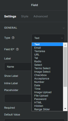
Various field types share common controls and have unique controls. The controls are classified in three tabs: Settings, Style and Advanced.
Controls in the settings tab are majorly different. Each field type has unique settings controls to serve its specific uses. However, a few settings controls are basic and appear in almost every field type, i.e. Field ID, Label.
Style tab controls are built for customizing field layout, style and shape. The controls are designed differently for various field types. Some style controls are the same in many field types, such as padding, Border Radius, and Background Color.
Advanced tab controls are basically the same in every field type. The controls are Margin, Padding, Size, Box Shadow, Custom Class/ID, Border, Background, Position, Attributes, Custom CSS, Repeater Trigger, Next/Previous Multi-Step Form, Multi-Step Form Animation, and Conditional Visibility.
Action with Fields
1. Add a field
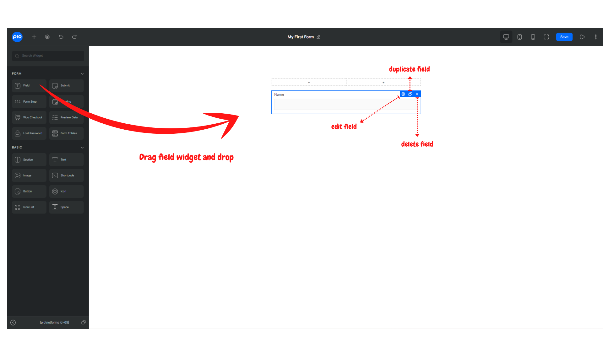
A field in Piotnet Forms is a widget, to add a field, drag the field widget in the left editor and drag it into position in the form.
2. Edit, duplicate, and delete field
In the top right corner of the field widget, there are 3 buttons for edit, duplicate and delete the field.


