Widget Learning
In this article, you will learn about Piotnet Forms widgets.
Piotnet Forms widgets are essential to build forms. The widgets are divided into categories and ordered in the Left control. There are 2 categories at the moment: Basic and Form.
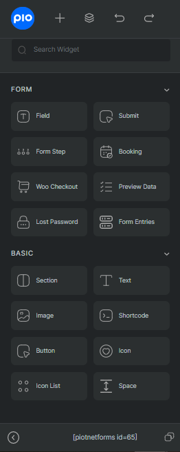
Basic
Basic Widgets includes the principal elements for almost every forms. Those are Section, Text, Image, Shortcode, Button, Icon, Icon List, Space.
- Section: use to build form layout and be container of the form elements
- Text: add texts into form
- Image: add images into form
- Shortcode: add content/templates in convenient way
- Button: Trigger redirect action
- Icon: add icons into your form
- Icon List: add a list with icons into your form
- Space: add space between contents
Form Widgets
Form widgets are functional widgets for various types of form. The widgets are built for unique purposes.
- Field: collect necessary information from users
- Submit: trigger form actions
- Form Step: add multi-step form
- Booking: use to add booking form
- Woo Checkout: setup WooCommerce Checkout page
- Preview Data: add preview data window
- Lost Password: add lost password redirect question
- Form Entries: access all data submitted through the opening form
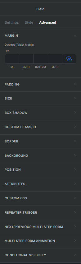
Widget Controls
Piotnet Forms offer three tabs of controls for widget: Settings, Style and Advanced
- Settings Tab:
Setup bare-bones input for the widgets. The inputs are normally mandatory and required you to enter.
The controls and options in settings are unique for each widget types. - Style tab:
Decide how your widgets looking. Controls in style tab are normally the same for various widgets, but there are also unique ones. - Avanced Tab:
Contains advanced controls for further customization. Advanced controls are fixed for all widgets.
Some of the controls: Margin, Padding, Background, Position, Repeater Trigger, etc.