Image Select Field
Tutorial Steps to set a basic Image Select Field
Create a field widget
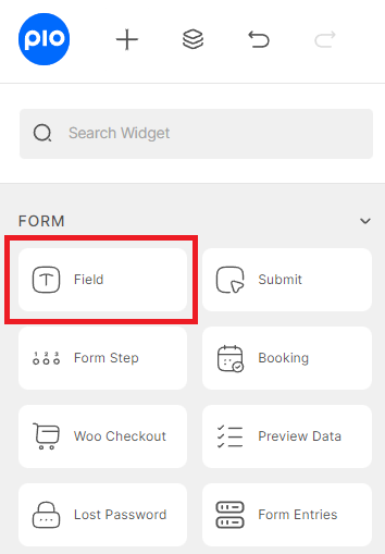
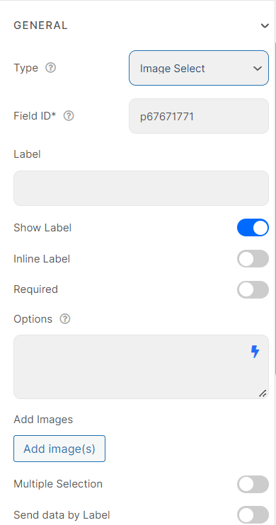
To begin, create a field widget and switch its type to “Image Select Field”
Options Box
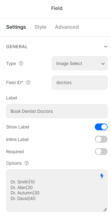
In the Options box, set options for images. Enter each option in a separate line. To differentiate between label and value, separate them with a pipe char (“|”)
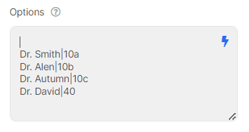
By default, the first option is selected. If you don’t want that, please add a blank line or a pipe char/vertical in the first option.
Add Images
Then add corresponding images, and click “Add Images”.

Other Controls
You also can choose to enable or disable “Send data by label” or “Remove this field from repeater”.
With Multiple Selection Enabled, your customers can choose many options. Besides, you can set Limit Multiple Selects, Default Value.

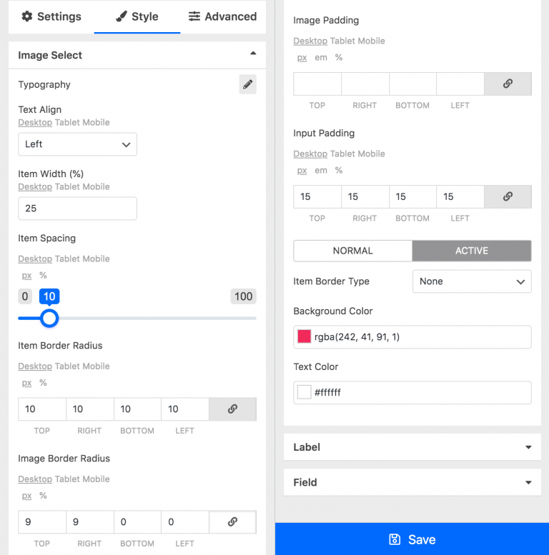
You can customize your style with many options
In many cases, you desire to use the same values for options to calculate. Your Form absolute will not work properly with the same values.
Solution: Implement alphabet characters right behind the same values. You can perform calculations with a letter appended to the numerical value.
Notice: This solution could apply to field types: Select, Radio, Image Select, Checkbox, and Select Autocomplete.
