
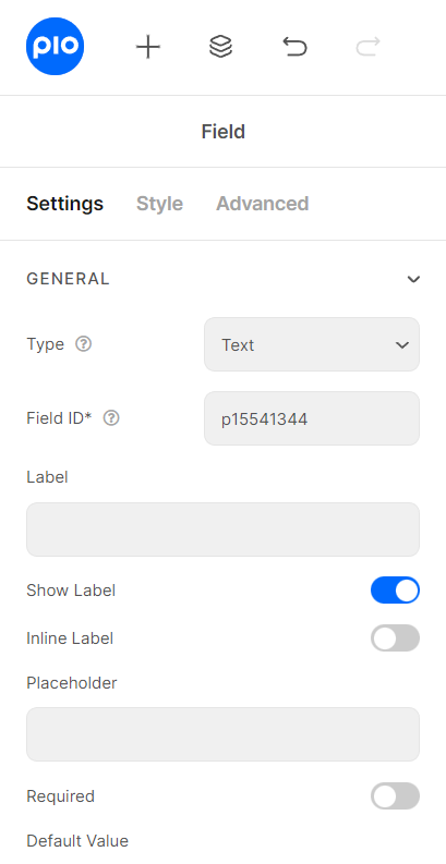
Field Setting
These basic settings are applied commonly for all the Form Fields and contain almost the same set of options. To show you what we mean, let’s see the Text Field for an example
Identity of the Form: Since Piotnet Forms version 2.0 has been upgraded, the Form IDs would be automatically dynamic in a place of the Form Setting.
How to name your Form ID: Be aware that you can use only Latin characters for this name. Numbers and underscores are also acceptable, but do not leave spaces. If you want to use multiple words to name the field, divide them with an underscore.
E.g. order_form (use an underscore instead of a dash/hyphen)
Identity of the Field: has to be unique in a Form.
How to name your Field ID: Be aware that you can use only Latin characters for this name. Numbers and underscores are also acceptable, but do not leave spaces. If you want to use multiple words to name the field, divide them with an underscore.
E.g. your_field_id (use an underscore instead of a dash)
Furthermore, please do not enter Field ID = product.
Currently, our Plugin has 30 field types with different utilities and operations. With this diversity, our plugin can make a variety of powerful Format Forms
Do not worry, we will show how to use specific field types after introducing the elements in a field.
It is a name that appears above the field bar and is visible to users. Usually, it shows the users what kind of information this field requires. For instance, it can be Name, Phone, or Address
Depending on your purpose, you can show the Label of the field or not by this function.
As the name of the function, it helps your Label and input field be placed in the same row.
The text content will be shown inside the bar until the user clicks on it. You can create an example of data you want the user to put in. Unlike the Default Value, this text does not count as data that fills in the bar. In case the field is required, the user would still have to complete the user’s own information.
When you enable this function, user obviously has to fill out/choose options in this field. Once user ignore it, the system will warn by a default message.
The data you place here will be automatically added to the field. Users are able to change it; however, this information will be added if users do not replace it.
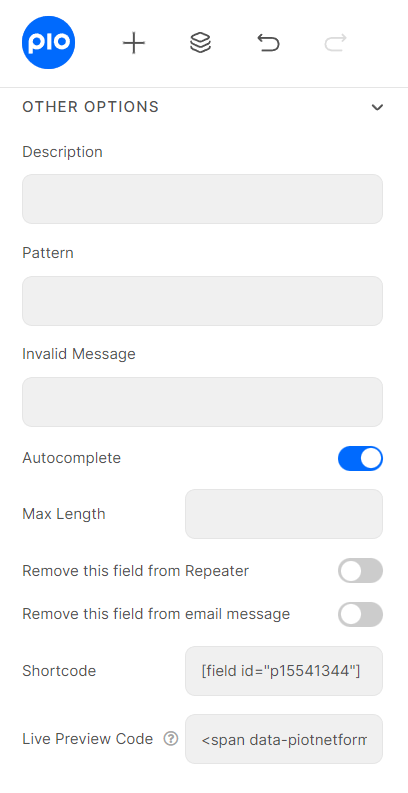
In order to customize format for your input fields, you can set up condition into Pattern box.
For example:
[A-Z]* Uppercase letters are valid for your field.
[0-9]* Numbers are valid for your field.
^.{8,16}$ Limit min and max characters in Password Field.
^\d{5,7}$ Limit min and max number characters in Text Field.
For more information, please reach to
The Autocomplete function provides suggestions while you type into the field.
You could get the input data of the field by embedding this shortcode into a hidden field, calculated field, email, or other actions in Submit Button
You are able to show the input data to show up directly on your Form.
To get a demo, please click here
You can implement an Icon from our default icon media or your image, and also are able to customize size, position, color of the icon.